Write to the booksellers
-
Type
Art print (2)
Autograph (4)
Book (33579)
Magazine (146)
Manuscript (3)
Maps (1)
Photographs (8)
-
Latest
Last 24h (98)
Last 3 days (3)
Last month (285)
Last week (18)
-
Language
Chinese (1)
Dutch (3)
English (108)
French (33491)
German (9)
Greek (1)
Italian (112)
Japanese (1)
Latin (5)
Polish (1)
Portuguese (4)
Russian (3)
Spanish (3)
Swedish (1)
-
Century
16th (32)
17th (77)
18th (571)
19th (4311)
20th (11265)
21st (1726)
-
Countries
Belgium (7839)
Brazil (14)
Canada (11)
Côte d'Ivoire (35)
Denmark (145)
France (24433)
Germany (9)
Greece (3)
Netherlands (1)
Switzerland (1253)
-
Syndicate
ALAC (11)
CLAM (15)
CLAQ (3)
CNE (19)
ILAB (13901)
NVVA (532)
SLACES (531)
SLAM (13119)
SNCAO (64)
Caspar David Friedrich . Die Erfindung der Romantik
M nchen, Hirmer Verlag, 2006 Hardcover, 383 Seiten, sehr reich illustriert mit farbigen Illustrationen, Deutscher Text. ISBN 9783777430157.
Dieser Band, der die gr te Caspar-David-Friedrich-Ausstellung seit ber 30 Jahren begleitet, bietet einen umfassenden und einzigartigen berblick ber sein Werk. Neben dem reich illustrierten Katalog zeichnen Essays renommierter Wissenschaftler die Entwicklung von Friedrichs Stil nach.
Posthume verzen of, Le silence tel qu'on le parle (met opdracht)
, A.A.M. Stols, 1961 Linnen band met stofomslag, 121 pagina's, 20.5 x 13 cm, met opdracht van de auteur, Nederlandstalige tekst. *mooie staat .
Posthume verzen of, Le silence tel qu'on le parle (met opdracht)
Diagramme N° 74 - Le bruit
Editons du cap Monte-Carlo. Avril 1963. In-12. Broché. Bon état, Couv. convenable, Dos satisfaisant, Intérieur frais. 95 pages environ illustrées de nombreuses photos et dessins noir et blanc.. . . . Classification Dewey : 500-SCIENCES DE LA NATURE ET MATHEMATIQUES

Classification Dewey : 500-SCIENCES DE LA NATURE ET MATHEMATIQUES
bladen voor de grafiek nr.1 jrg 14 - DIRK HUYGHE
, Beveren-Melsele, 1981., In suite, originele uitgeversomslag, 21,5x28cm, z.p., geillustreerd met 10 originele houtsneden.
DIRK HUYGHE De bladen voor de grafiek nr.1 jrg.14
LA NATURE. REVUE DES SCIENCESET DE LEUR APPLICATIONS AUX ARTS ET A L'INDUSTRIE. 1er SEMESTRE 1894. N°1070 à 1095.
G. MASSON. 1893-1894. In-4. Relié demi-cuir. Etat d'usage, Couv. défraîchie, Dos frotté, Intérieur frais. 427 pages. Dos cuir bordeaux, titres et filets dorés, papier rouge et gris sur les plats. Nombreuses gravures en noir et blanc dans le texte. Texte sur 2 colonnes. bords et coins frottés. Manques sur le revêtement des plats. Epidermures.. . . . Classification Dewey : 500-SCIENCES DE LA NATURE ET MATHEMATIQUES
Classification Dewey : 500-SCIENCES DE LA NATURE ET MATHEMATIQUES
Le bord de la mer. Ce qu'on y rencontre de plus joli de plus curieux... ou de plus interessant pour la cuisine.
P., Duchartre, sans date, in 8° broché, 115 pages ; illustrations ; couverture illustrée.
Les planches et les animaux reproduits par la photographie du sujet vivant. Planches en couleurs daprès les aquarelles de E.-A. Seguy.Pêches et recettes par Maurice CABS. ...................... Photos sur demande ...................


Phone number : 04 77 32 63 69
Paris - Ile de France - Val de Loire
,Paris, Publications françaises 1951, 179 pp., 1 vol. in 8 relié plein toile (rel. éditeur), jaq. (défr.), illustrations in et hors-texte
Mascherini.
Milano, All'insegne del pesce d'oro., 1969 Bound with dustjacket, 225pp., 27x37cm., num. ills. in bw., good cond.
1 of 800 copies in Italian language (n 347).
De mémoire de foetus, l'héritage familial s'inscrit dans nos cellules dès la conception - Éditions le souffle d'or - Gap 2021
Broché, comme neuf, 125x195, 208 gr, 184 pages, Préface du professeur Jean-Pierre Relier, ISBN: 978-2-84058-398 - 9782840583981
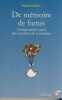
Dans le déroulement de notre parcours de vie, il y a certaines difficultés qui ne trouvent aucune explication "raisonnable". Leur origine remonte souvent aux empreintes des événements que nous avons vécus dans la vie intra-utérine. Le foetus "capte" littéralement toutes les vibrations de peur, tristesse, colère, joie. Il perçoit les ressentis du vécu des parents dans leur environnement. Edmée Gaubert nous éclaire sur l'importance de cette période intra-utérine. Son style direct et léger lui permet d'aborder des situations graves avec délicatesse et humour, dans des perspectives de prévention et de guérison. Un livre pour mieux comprendre l'influence de notre héritage familial et prendre soin de nos enfants à naître!
La Révolution Française
Paris Gallimard 2007 In-8 207 pp, NRF Bibliothèque des sciences humaines
Bon Broché à raba
Le Modèle français depuis 1945
Presses Universitaires de France - PUF 2008 128 pages 17 2x1x11 4cm. 2008. pocket_book. 128 pages.
Etat correct
Paolo Delle Monache (sculptures et dessins).
COMICE AGRICOLE D'ALBI. Avril 1998. In-4. Broché. Bon état, Couv. convenable, Dos satisfaisant, Intérieur frais. 69 pages. Nombreuses illustrations en noir et blancen hors- texte. Textes en italien et en français.. . . . Classification Dewey : 20-Bibliothéconomie et sciences de l'information
Classification Dewey : 20-Bibliothéconomie et sciences de l'information
[Librairie Orientaliste, Paul Geuthner] - GAUDEFROY-DEMONBYNES, Maurice
Reference : 58226
(1923)
Le Pèlerinage à la Mekke. Etude d'histoire religieuse [ Le Pèlerinage à la Mecque - Edition originale ]
1 vol. in-8 reliure demi-basane marbrée, dos à 4 nerfs, couv. conservées, Librairie Orientaliste, Paul Geuthner, Paris, 1923, frontispice, VIII-322 pp.
![Le Pèlerinage à la Mekke. Etude d'histoire religieuse [ Le Pèlerinage à la Mecque - Edition originale ]. GAUDEFROY-DEMONBYNES, Maurice](https://static.livre-rare-book.com/pictures/CDL/58226_thumb.jpg)
![Le Pèlerinage à la Mekke. Etude d'histoire religieuse [ Le Pèlerinage à la Mecque - Edition originale ]. GAUDEFROY-DEMONBYNES, Maurice](https://static.livre-rare-book.com/pictures/CDL/58226_2_thumb.jpg)
![Le Pèlerinage à la Mekke. Etude d'histoire religieuse [ Le Pèlerinage à la Mecque - Edition originale ]. GAUDEFROY-DEMONBYNES, Maurice](https://static.livre-rare-book.com/pictures/CDL/58226_3_thumb.jpg)
Bon état (petit accroc au dos en queue, bon exemplaire par ailleurs) pour cet ouvrage fondamental du savant arabisant, spécialiste de l'Islam et historien des religions Maurice Gaudefroy-Demonbynes (1862-1957). Les divers rites accomplis lors du pèlerinage font l'objet d'un exposé systématique et très minutieux, et l'étude s'appuie sur toute la documentation alors disponible pour le chercheur occidental.
Liste alphabétique des espèces du genre ampullaria de lamarck
1880 25 pages in-8. 1880. broché. 25 pages. Extrait du bulletin de la société d'étude des sciences naturelles de Béziers
Bon état
GRANDES AVENTURES DE LA SCIENCE
ANDRE BONNE EDITEUR. 1966. In-12. Broché. Bon état, Couv. convenable, Dos satisfaisant, Intérieur frais. 253 pages. Quelques planches illustrées de photos en noir et blanc.. . . . Classification Dewey : 500-SCIENCES DE LA NATURE ET MATHEMATIQUES
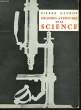
Collection documentaire illustré. Classification Dewey : 500-SCIENCES DE LA NATURE ET MATHEMATIQUES
Considérations générales sur les animaux fossiles de Pikermi
Paris, Savy éditeur, 1866. Petit in/4 (28 x 18 cm) 68 pages. Manque la couverture supérieure, cahiers partiellement décousus, rousseurs, une large auréole claire sur la partie supérieure des feuillets.
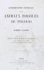
Jean Albert Gaudry (1827 - 1908) géologue et paléontologiste français. La présente notice est extraite de l'ouvrage intitulé "Animaux fossiles et géologie de l'Attique" d'après les recherches faites en 1855-56 et en 1860. Une seul livraison par semaine pendant le mois d'août
Un naturaliste Francais: le marquis de Saporta
REVUE DES 2 Mondes,1896,tire a part ?,pagine 303 a 328p.,
couverture factice,texte frais, Remise de 20% pour toutes commandes supérieures à 200 €
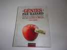
GENIES PAR HASARD
ces petites et grandes découvertes qui ont change le mon,de. Format moyen, cartonné.256 pages.illustrations n/b et couleurs. Bon état. Une expédition par Mondial Relay vous sera proposée 2012 Dunod
LA SANTE ET LES CONDITIONS ATMOSPHERIQUES
Hachette ,1967, in-8 de 254 pages ,ill. in-t et h-t., carte ,Couverture souple ,Bon état , .(4 photos du livre sur mon site https://www.vieuxlivre.fr) .Les frais de port pour la France sont offerts à partir de 25 euros d'achat (Mondial relay ). (colissimo suivi +6,90 ).
Savoir Communiquer - Editions du Centre d'Étude et de Promotion de la Lecture Paris 1970
grand in-8 carré reliure éditeur skyvertex sans la jaquette, 252 pages, très bon état, collection "Comprendre Savoir Agir" Introduction François Richaudeau
Méthodes pour étudier la répartition des astres dans le mouvement diurne
1957 édition 1957, in-8 broché de VIII+112 pages, figures noir et blanc, préface de Jean Porte. | Etat : Bon état général, écriture au stylo sur une garde, une partie de l'ouvrage se détache, ouvrage complet. (Ref.: ref8211)
Connaître les Autres - Editions du Centre d'Étude et de Promotion de la Lecture Paris 1970
grand in-8 carré reliure éditeur skyvertex sans la jaquette, 254 pages, très bon état, collection "Comprendre Savoir Agir"
Mesure absolue de l'intensité du magnétisme terrestre in Annales de chimie et de physique - Goettingue 1833, Tome 57
P., Crochard, 1834, un volume in 8 relié en demi-basane, dos orné de fers dorés (reliure de l'époque), (coiffe émoussée), pp. 5/69
---- PREMIERE EDITION FRANCAISE ---- "In September 1829 Quetelet visited Göttingen and found Gauss very interested in terrestrial magnetism... In 1832 Gauss presented to the Academy the Intensitas vis magneticae terrestris ad mensuram absolutam revocata (1833) in which appeared the first systematic use of absolute units (distance, mass, time) to measure a nonmechanical quantity. Here Gauss typically acknowledged the help of Weber but did not include him as joint author. Stimulated by Faraday's discovery of induced current in 1831, the pair energetically investigated electrical phenomena. They arrived at Kirchhoff's laws in 1833 and anticipated various discoveries in static, thermal and frictional electricity...". (DSB V p. 305)**2300/M6DE
Recherches arithmétiques. Traduites par A.C.M. Poullet Delisle -- PREMIERE EDITION FRANCAISE -- TRES BEL EXEMPLAIRE
P., Courcier, 1807, un volume grand in 4 (20,5 cm x 26,5 cm), relié plein veau glacé, dos orné de fers et filets dorés, filets dorés sur les plats, toutes tranches dorées, armes de l'Académie de Paris sur les plats (reliure de l'époque), 20pp., (1), 502pp.
---- PREMIERE EDITION FRANCAISE, SECONDE PUBLICATION ET PREMIERE TRADUCTION DE CET OUVRAGE PARU EN LATIN SOUS LE TITRE SUIVANT "Disquisitione arithmetica" ---- TRES BEL EXEMPLAIRE DE PRIX DE CONCOURS GENERAL AUX ARMES DE L'ACADEMIE DE PARIS RELIE EN PLEIN VEAU GLACE, TOUTES TARNCHES DOREES, DOS RICHEMENT ORNE DE FERS ET FILETS DORES, FRISES DORES SUR LES PLATS ---- Ce livre ne connaîtra pas d'autres publication et traduction avant 1889 (traduction allemande) ---- "The discovery of the law of quadratic reciprocity, with other vital developments in the theory of numbers". (Horblit N° 38 1st latin ed.) ---- "In a century of brilliant mathematical contributions, Gauss's share was the foremost, for his intuitive mind leapt from solution to solution of problems ages old and the new ones of expanding science. The substance of the above book had been prepared when Gauss was 18. it holds the important law of quadratric reciprocity (accomplishing what Euler and Legendre did not complete), followed by the notation of binary quadratic forms, the introduction of the theory of congruences, expansion of quadratic forms, and a new theory of the division of the circle". (Dibner N° 114 1st latin ed.) ---- DSB - PMM N° 257 & Norman N° 878 (1st latin ed.)**5988/arm3
Recherches arithmétiques traduites par A.C.M. Poullet-Delisle
P., Blanchard, 1910, un volume in 4, broché, couverture imprimée (légèrement défraîchie), 20pp., (1), 502pp.,
---- Nouvelle édition**2301/N5DE